Koinonia Farm
Branding
Packaging Design
Visual Direction
Identity Design
Koinonia Farms is a Georgia-based community farm known for its handmade foods and fair-trade products. I developed a brand identity that reflects its values of connection and sustainability. The project included a new logo, color palette, and packaging system that highlights the brand’s heritage while appealing to a modern audience.


Cultivating A Visual Voice
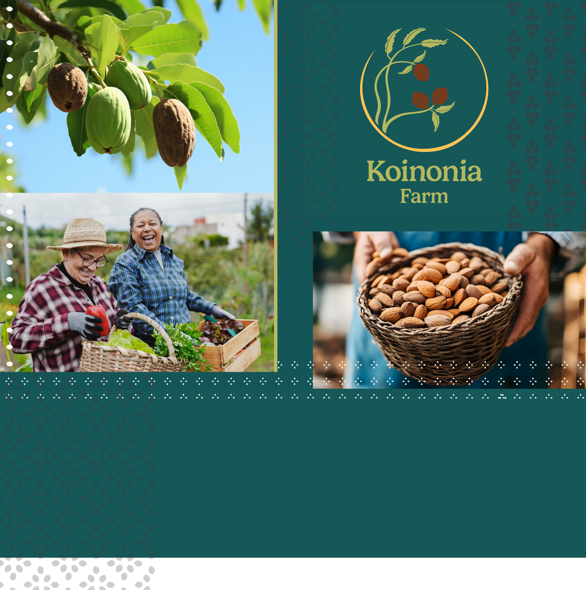
The color palette combines natural tones with a modern flair, using greens, blues, and browns inspired by the farm. Imagery features close-up shots that immerse the viewer in the landscape, while pecan motifs and farm-style patterns celebrate the warmth of Southern culture and community.
The community engagement signage has a handmade-style illustration of a pecan branch within a circular frame, evoking wholeness and care.
The font feels friendly and farm-inspired, with a subtle modern flair.
.gif)

Store Emblem and Products
The online and in-person store feature clean, minimal product designs that highlight the illustrated circle pecan or the store logo emblem.
Each item uses the brand’s natural color palette to maintain a sense of warmth and simplicity.
The emblem and products are designed to feel handmade and rooted in tradition, while still appearing clean.
.gif)
.gif)


Administrative Products
For presentations, outreach and administrative materials the illustrated circle pecan is used as a supporting mark while keeping the focus on the name. This ensures brand clarity and recognition.
.jpg)
