Dr Teals Rebrand
Visual Identity, Logo, Packaging, Animation
Dr. Teal's refreshed branding encapsulates natural wellness and therapeutic self-care, drawing inspiration from waterfalls, spas, and apothecaries.
The logo's word mark features a 'T' inspired by a waterfall and gracefully encircled by a 'D'. The foundation for the logo's typeface is Hegante Display and is modified to create a distinct fluidity found in the logo's word mark.
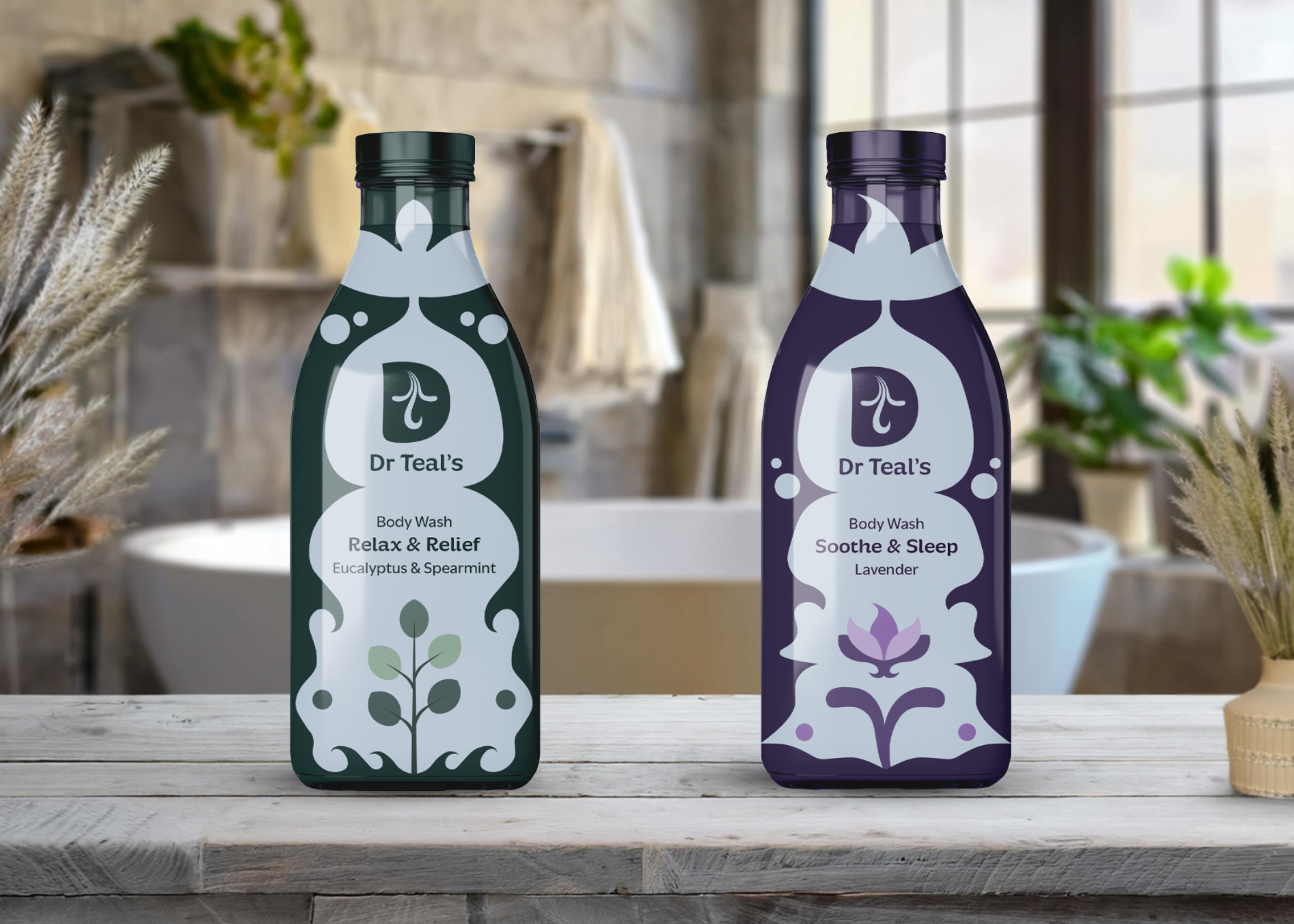
The packaging highlights each unique color palette and illustrations that reflect the natural ingredient This ensures that each ingredient is the focal point. The packaging design incorporates apothecary-style bottles, reimagined with a modern twist of luxury spa aesthetics. These elements combine to create a playful yet sophisticated presentation.

Social Animatation
This short-form animation invites viewers to escape into the world of Dr Teal’s, reimagining a daily routine as a sensory ritual. Designed as part of a larger rebrand, the piece uses motion to zoom into the bottle, revealing a calming apothecary-inspired landscape.
The goal was to position Dr Teal’s as both accessible and elevated, grounded in natural ingredients but imagined with storytelling at its core. A visual entry point into a brand that turns your bathroom into something more.
Concept Board

Bottle Design
Logos


